

Image: Guy Goodwin, Chicken Finger Palace (detail), 2014, acrylic and tempera on cardboard, 76.5 x 92.75 x 14 inches
Guy Goodwin - Light & Delight
Essay by Paul D’Agostino
October 20 - November 12, 2023
Opening reception: Friday, October 20, 6 - 9 PM
Artist Talk: Sunday, November 12 at 3 PM
Painters Talking Painting: Guy Goodwin and Harriet Korman in conversation
The talk will be streamed on Instagram Live starting at 3 PM. Please tune in if you are unable to join us in person.
Also on view: Barbara Laube: Rhythm of Twilight
Paradox and Levity in Guy Goodwin’s Light & Delight
by Paul D’Agostino
Guy Goodwin has toiled long and arduously as a champion of, and uniquely innovative voice in abstract painting. In so doing, the celebrated artist has employed a broad range of mixed media, experimented with diverse processes and formal registers, and explored a variety of expressive modes, all the while dutifully nodding to and regularly bucking tradition. Goodwin has worked tirelessly, reverently, restlessly, irascibly, and on occasion, rebelliously. Yet what the artist’s mixed creative humors have yielded with overall consistency is artworks that exude freshness, joy, and levity, qualities in abundance in Light & Delight.
Surely there is something slightly paradoxical about so much laboriousness resulting in such palpable lightness of aesthetic and mood. But this sense of paradox is something Goodwin has always embraced, from his early days working in chromatically bold, gesturally dynamic, expressively marked abstractions, to the subsequent years he spent focusing on candidly delineated still-life compositions far quieter in energy and palette alike. Working in the latter vein for a while – initiated as an effort to shore up his own still-life chops in preparation for a new teaching assignment – served as a kind of cooling period for the artist, a time to allow flexibility of approach and conceptual slack into his aesthetic convictions so as to see things with softer eyes. His perceptions came to be informed less by rant and rebuttal, and more by openness and discovery. For Goodwin, the world in general, and in certain ways the art world in particular, went from a source of antagonism and strife to a locus of communication, exchange, and collaboration. Before long, the still-life works gave way to a return to minimalism, ambiguous subjects, and non-objective, individuated forms – or rather, to ambiguous forms and abstracted objects arranged and iterated as repeatable subjects. That is, the artist’s interest in objects as subjective shapes became an interest in shapes subjected as objects. More simply, Goodwin was back to stripping things down and having fun.
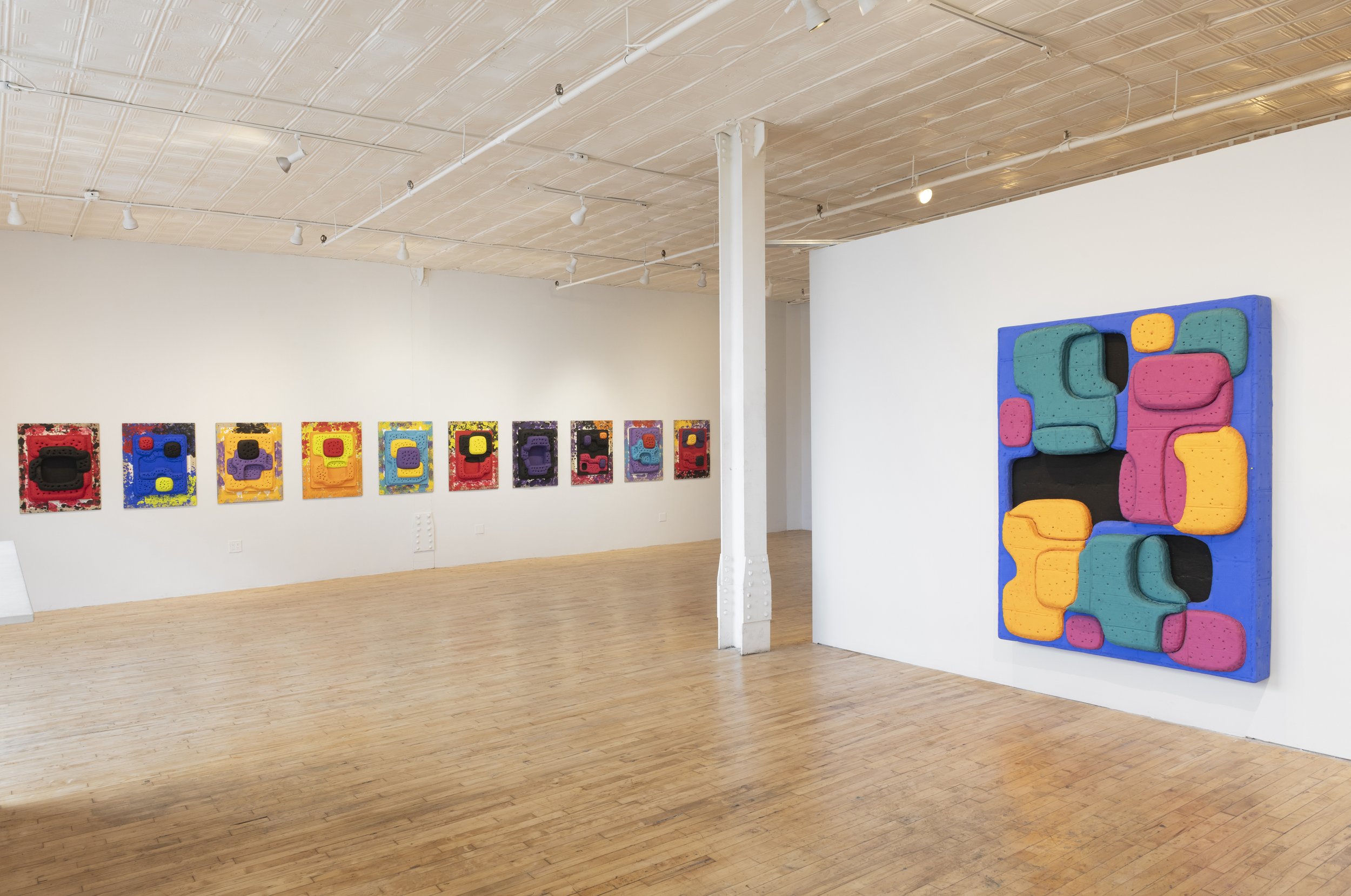
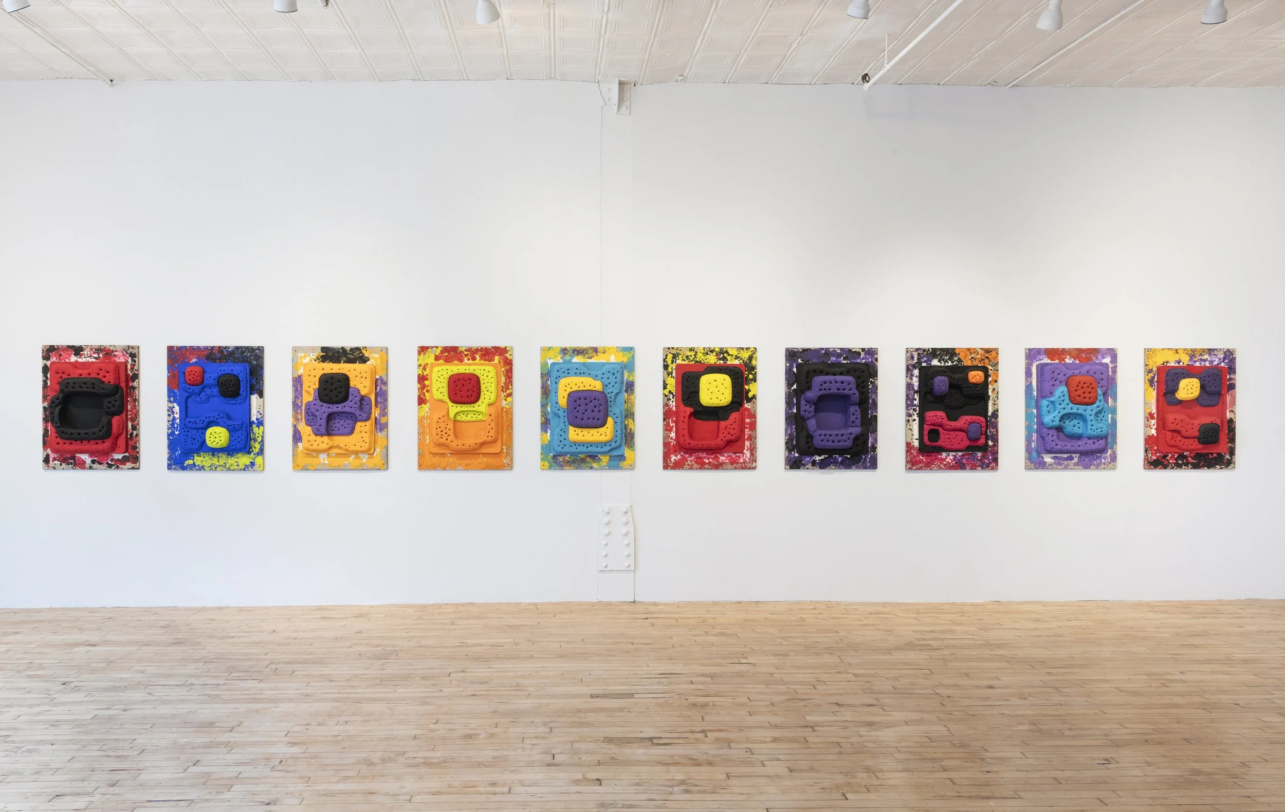
Starting around 2010, capitalizing on a bit of serendipitous discovery, the artist began repurposing large pieces of found cardboard to build his surfaces up and out, demonstrating the type of necessity-driven resourcefulness that has been a feature of many of his most significant transitional moments. This allowed him to continue creating large works that might spread out, protrude, and impose, yet whose physical heft would remain, in a certain sense, merely apparent, something the artist referred to in a recent conversation as an “illusory weight”. This resulted in more than just a work that might’ve weighed hundreds of pounds now weighing only a fraction of that. A new trademark aesthetic emerged out of this material shift as well. Goodwin’s process now involved constructing ultimately deep-relief surfaces from the ground up, so to speak, by laying down large pieces of cardboard before layering upon and around them strata upon strata of smaller cardboard cutouts of amorphous, amiably contoured shapes. Drywall screws and staples entered the pictorial space as well, as much for structural integrity as for textural rhythm, material grist, and visual grip. Substantial hardware, substantial thickness, and substantial heft both real and ostensible became unmistakable in Goodwin’s reformed compositions – yet an ultimate sense of lightness remained. The artist elucidated succinctly this matter of levity and “illusory weight” in a 2017 discussion between him and Brooklyn Rail publisher Phong Bui, held on occasion of Grotto Relief at Brennan & Griffin, one the first major showings of Goodwin’s cardboard works. “It’s very physical in the form,” remarked the artist with regard to one of his paintings, “yet the colors are light and delightful.”*
This quote furnishes a fitting segue to Goodwin’s marvelously punchy, veritably scrumptious colors, and to an additional aporia pertinent to his works – not one of heft, this time, but of luminosity, and one that is a partial consequence of the artist’s various studio spaces over the years. Although light as luminosity is as important to Goodwin as lightness of material or mood, he remarks that many of his studios have been “dark and cave-like”, their scant natural light heavily filtered and dimmed down by frosted windows, and their extant artificial illumination generally unsatisfactory. With spotlights strung up all around to compensate, Goodwin’s studios have been places where he finds himself working against the ambient light rather than with it. Even if the light has been reliably poor, it has also been unreliable otherwise – unreliable, that is, in how it interacts with certain media, a dilemma that often extended to the generally inconsistent if not undesirable lighting situations he encountered when exhibiting his works in various gallery spaces. Goodwin’s solution was to develop his own painting concoction, one that might channel his enthusiasm for luminosity while imbuing his works with a degree of pictorial immunity from the vicissitudes of ambient lighting in studio and exhibition spaces alike. In another instance of necessity-driven resourcefulness, Goodwin tinkered with a novel recipe for tempera, blending raw pigments into a medium of Elmer’s glue. The results were perhaps far better than he’d foreseen, allowing him to craft a full range of colors as rich and vibrant as he’d hoped, yet much more usefully, light-absorptively matte – a whole new palette of colors that seemed to simultaneously exude and devour whatever type of light they fell under.
From his reconsidered surfaces and processes to his handcrafted colors, this is still, by and large, the mode in which Goodwin is working now, and with just as much enthusiasm. He gives his cardboard substrates and relief-tending composite shapes acrylic coatings before painting over them with his homespun tempera, and he builds things up painstakingly and gradually until his meticulously layered, carefully arranged, patently drywall-screwed, and copiously stapled surfaces manifest not as overtly sculptural paintings-as-objects, rather as formally curious showcases of the basic elements of painting that have always excited him the most. Colors, shapes, textures, depths, rhythms, curves, contours, and some sense of compositional charisma: these constitute the trappings of Goodwin’s pictorial world regardless of scale, palette, or thematics. One looks at these paintings, sure, but also into or upon them, as if regarding from above a perspectivally suggestive floor plan replete with divisions, points of entry, exits, foyers, and furnishings. In this way, Goodwin’s larger works present as immersive encounters within such spaces, while his smaller pieces register as glimpses into them through doors, windows, or skylights.
In Light & Delight, large paintings like Elvis Dust and Club for Trio 3 reference music, pop culture, and mixed nostalgias while presenting as wholly navigable dioramas. Strange and ambiguous, the spaces implied in these compositions are both subtly mysterious and unabashedly mirthful – inviting places where corners are rounded off by scalloping and curves, and where stretches of flatness are aerated and softened by structural pockmarks that scan as graham-cracker dimples. Full of nooks, openings, and puzzle-like ruptures and junctures, Elvis Dust is a feast of friendly composite formations of chunks and lumps of variable pinks – ranging from pale bubble gum to strawberry milk, cherry ice cream, and raspberry wafer. Jazzier, more robustly blatant, and chromatically catalytic with bright orange, wine red, and chalky purple forms popping off a deep black bed, and with patches of exuberant neon yellow beaming out from opposing corners, Club for Trio 3 is both a dance of shapes and a shapely layout for a stage or dance floor, or for a luxurious lounge for bopping to the smoothly rhythmic sounds that seem to bounce all around. It is Goodwin’s homage to the famed jazz group Trio 3 – comprised by Oliver Lake on saxophone, Reggie Workman on bass, and Andrew Cyrille on drums – whose groundbreaking techniques of improvisation and synergetic collaboration have long served as inspirational touchstones for the artist, creative heights to admire and emulate. In crafting these large paintings, Goodwin’s process entailed devising and elaborating them intuitively and directly, with the layout and planning taking place in the act of making rather than beforehand. While making the numerous small and medium-sized works also featured in Light & Delight, however, Goodwin found himself returning to earlier practices of making drawings first, then crafting relief-amplified paintings recreating, riffing on, and responding to his sketches.
Goodwin has honed his pictorial toolkit over several decades, tweaking and revamping it manifold times along the way. He has welcomed and responded to challenges as they’ve presented themselves to him, and he’s challenged himself when external challenges were less present or pressing. While Goodwin’s work has long been informed by pushing back on the world, aesthetically and sometimes ideologically, it has also given him reason to lighten up on it – and to, in turn, lighten up on himself. To view Goodwin’s paintings in Light & Delight is to bear witness to his uniquely creative dynamic of reconsidering, manipulating, leavening, and softening.
________________
* “In Conversation: Guy Goodwin with Phong Bui,” The Brooklyn Rail, July-August 2017 issue.
– Paul D’Agostino, PhD is an artist, writer, curator, and translator. You can find him on Instagram and Threads @pauldagostinostudio.

Image: Guy Goodwin, Chicken Finger Palace, 2014, acrylic and tempera on cardboard, 76.5 x 92.75 x 14 inches
Past Solo Exhibitions include Guy Goodwin: Paintings 1974, 2008, Kathryn Brennan Gallery, Los Angeles, CA, Jeanie Freilich Fine Art, New York, NY, Thorden/Wetterling Galleries, Stockholm, Sweden, Segal/Steinberg Gallery, Montreal, Canada, Heland/Wetterling Gallery, Goteberg, Sweden. Group Exhibitions include: High Times, Hard Times: New York Painting 1967 - 1975, curated by Katy Siegel with David Reed advising, Weatherspoon Art Museum, Greensboro, NC (Aug - Oct 2006), National Academy Museum, New York, NY (Feb - Apr 2007), American University Museum, Washington, DC (Nov 2006 - Jan 2007), Drawing with Respect to Painting: Guy Goodwin, Brice Marden, Elizabeth Murray, The New York Studio School, New York, NY. Public Collections include: The Brooklyn Museum of Art, Brooklyn, NY, Centro Cultural Arte Contemporaneo, Mexico City, Detroit Institute of Arts, Detroit, MI, Lannan Foundation, Los Angeles, CA and The Museum of American Art, Philadelphia, PA.


Images by Adam Reich
Press:
Press release